Lara Croft, obviously...
Microblog Memes
A place to share screenshots of Microblog posts, whether from Mastodon, tumblr, ~~Twitter~~ X, KBin, Threads or elsewhere.
Created as an evolution of White People Twitter and other tweet-capture subreddits.
Rules:
- Please put at least one word relevant to the post in the post title.
- Be nice.
- No advertising, brand promotion or guerilla marketing.
- Posters are encouraged to link to the toot or tweet etc in the description of posts.
Related communities:
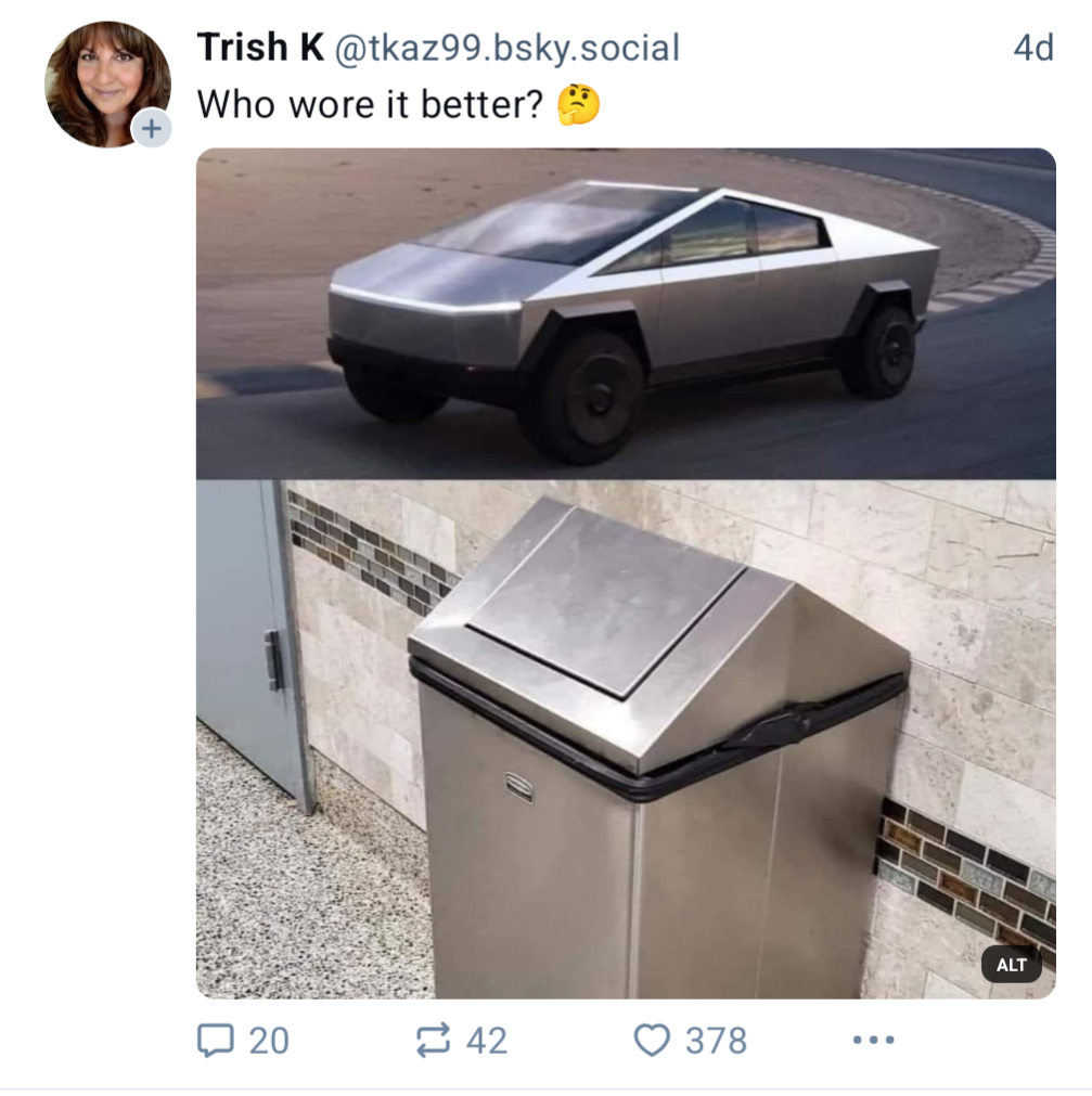
The actual trashcan will survive 1 mm of rain.
Also, this picture of the cybercan really shows the incredibly disgusting design. Nevermind the straight lines and outline, even if it's stupid and all, it is fine, but then look at that unaligned front corner.. god damn that's bad design. It's like two designers were working from the front and the back and had to meet their lines somewhere. It's like a 2D design being transferred to 3D and then instead of looking at the third axis, they just snapped it to fit.
The measurements are completely out of proportion too.
And while I'm at it, those pentagonal angled wheel fenders, it's pretty clear that the designer department hadn't run out of available angles to use. Oh, you're using a palette of angles? Well, here's the wheel fenders going by system default truncated to a pentagon, no or maybe it's a hexagon being cut above the middle. Who cares.. It looks like shit.
Edit: Having looked at the picture twice, I'd appreciate if you could also take a moment to appreciate the design of the trashcan. The slightly angled sides have a purpose. It makes it easier to avoid anything getting stuck when emptied and if fitted with a bag it'd come out without a massive pressure from the vacant air that would be in a fully vertical sided can.
The angles on the top also serves a purpose. It can be accessed from any angle, unlike trashcans that have vertical or horizontal openings. The push opening mechanism simply works better this way and naturally swings back to balance without adding a spring. In case a malicious person were to position trash to obstruct it, it can be pushed from either side and realign after the next user. The only thing I could ask more was if it was round.
Also, the car is not available in Europe. Not for the usual reasons like because of the engine, the weight, the milage or the safety for the driver. No. It was not allowed because the design is shit. It was not approved because its design is unsafe for anyone nearby.
I still feel hurt by just looking at it, but here's the thing: I understand why the designers couldn't make it better... There's no purpose for this car.
How can you design for something that doesn't have a fucking purpose?! Yeah sure we'd all like an electric van, but this is soooo far from fulfilling that purpose. The bed is to too small to carry a fucking Christmas tree. There are already much better electric vans available for less.
The only purpose of the cyberdumb and all of Tesla's vehicles is in the design. Mission Failed.
My brain doesn't want to accept it as a photo. It looks more like a screenshot from the Perfect Dark level Chicago.
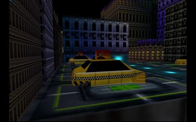
Even test drive 3 has more polygons than the cybertruck, I really can't find a game car that looks worse.
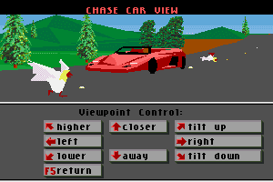
Nah, that's got more polygons, and it's even painted!
Woah major flashback
It's unfortunate because I think we need way more weird looking cars. Creative, just out there shaped vehicles of all kinds. It sucks that the company to do it was an unethical garbage fire led by a fascist. We deserve more ugly and weird heterogeneous consumer items.
I like that idea. But not from Space Karen.
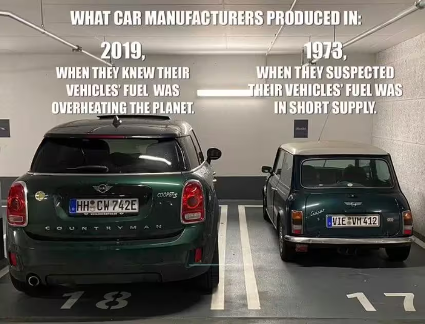
Since cars are a neccessity for most buyers to move from a to b, they are optimized to use as less energy as possible for it (running costs the manufacturer can't profit from). Which lead to airstream optimized vehicles, all looking about the same.
Ironically, since they are also still a status symbol for a lot of people, they got bigger and bigger, leading to heavyweight Van's, SUVs and "trucks" being more common, using more energy/fuel than is saved with the optimized surface.
You know, like this:
Good point. Ironically there have been a lot of smaller than usual, efficient vehicles that have been banned or not sold in my country. I don't think they were weird looking, but it does go to show how the factors that go into what cars show up on roads are not always logical. I wonder if we had a more competitive market with more manufacturers if we'd have more exciting shapes or colors. Prices would probably have to come down for people to buy them though. I saw a video a while back about car paint colors having a moment with matte paint and I thought, this is cool but also stunningly boring as far as trends go.
It's hardly a fair comparison. One is garbage and unable to withstand the elements without becoming a rust bucket and the other is a waste basket.
let me get a spray bottle of water and we can see which one catches fire
They both seem to perform the same function, as receptacles for trash.
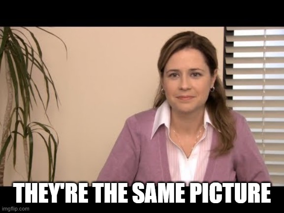
Can't fool me.
EVERYTIME I look at it I spot a new flaw, how is this even possible, I'm not even being memey, I'm just so shocked, how something so terrible could ever be released? how long did they work on that? 10 minutes?????
Honestly, I sort of suspect that Elon Musk took some crayons and printer paper, drew this up and told the designers "exactly like this!"
But my son drew a Cybertruck because he's 7 and his picture looked better than what Tesla made.
the ketamine probably doesn't help in leon's case

Definitely Trashbot.
Why even have the peak? Are cone heads their targeted customer? It's certainly not for aerodynamics.
"They're the same"
At least the trashcan is useful.
