I’ve been leaning on Lemmy communities for coding and self hosting tips. I tend to do most of my browsing on my phone and I’ve noticed Memmy doesn’t show any markdown in posts or comments.
- Any alternatives to using Memmy that is known to support code markdown?
- I’m not opposed to switching to the browser, but I don’t find the Lemmy.world layout particularly easy to navigate so I’d prefer an app or a good PWA
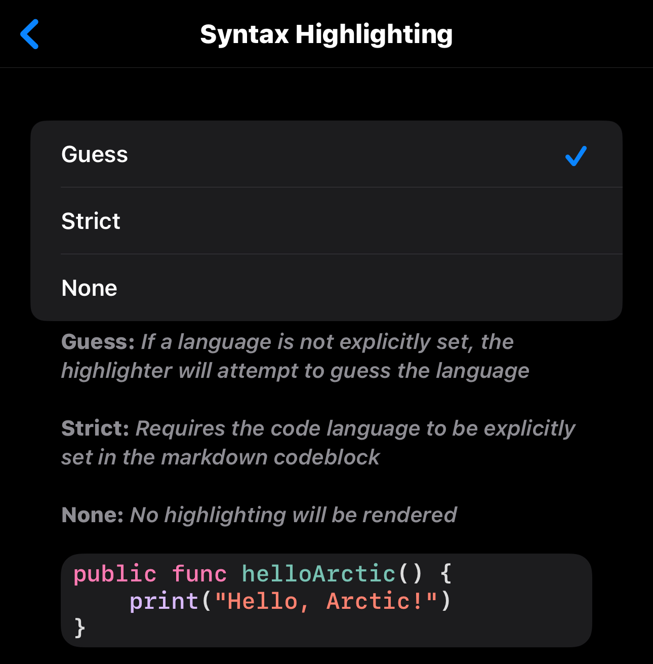
!arctic@lemmy.world has good markdown support and if it’s missing anything the developer is pretty good at making sure the next update supports it.
Yep arctic has some of the best support of this I’ve seen.

This is probably the one for me, really digging the level of customization and it’s easy to navigate.
As far as I know, Photon also supports markdown in comments. Lemmy World runs that as an alternate frontend at https://photon.lemmy.world/
Unless something changed, it has good PWA support.
Voyager and Memmy have markdown shortcuts in the comment editor.
AFAIK, most if not all iOS support markdown even though some may not have shortcuts in the comment editor; you would have to type them manually.
deleted by creator
first of all, i’ve never seen any, not even Apollo for Reddit, that did live styling. The preferred method has always been to show the markup in the editor so the user can modify it before posting or easily edit it afterwards.
second: what markup shortcuts are you wanting there to be? existing, end even past editors, typically only ever feature the most commonly-used markup in shortcuts simply due to space limitations in the interface. if you’re looking for shortcuts for things like tables and other advanced formatting, i doubt you’ll find that anywhere just because it’s uncommonly used and other shortcut bottoms would take UI/UX priority.
stuff like that didn’t even get added to Apollo until its final versions, and, AFAIK it was the only Reddit app that had them. In your case, you’ll probably have to just learn to type it in manually like the rest of us.
Removed by mod
well, i’m certainly not going around calling people names…
deleted by creator
Say the person clearly trying to pick a fight…
deleted by creator
deleted by creator
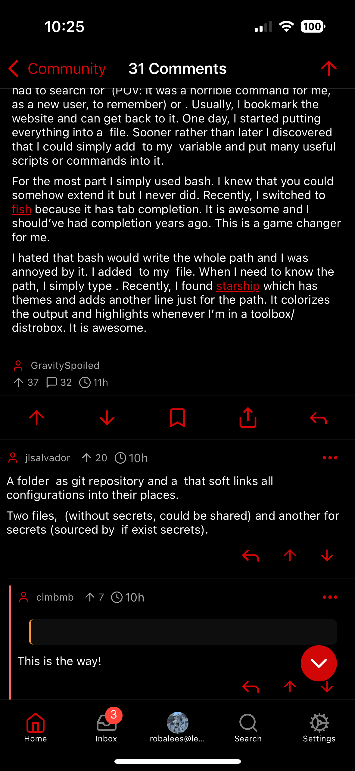
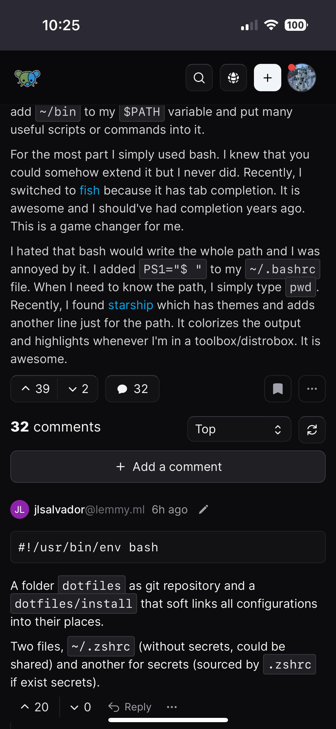
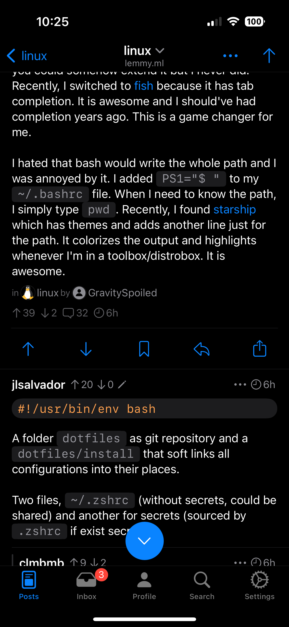
Thanks everyone for the comments so far, I’m including 3 screenshots of how a post looks in all 3 locations (Memmy, Photon & Arctic)
I think Arctic is the winner for me, I like the layout and settings. Also Memmy removed the swipe from left to access subscribed communities and it’s been impossible to get out of the habit, Arctic seems to do it!


