"I can't wait to see their next brilliant logo design!"

ಠ_ಠ
!gaming is a community for gaming noobs through gaming aficionados. Unlike !games, we don’t take ourselves quite as serious. Shitposts and memes are welcome.
1. Keep it civil.
Attack the argument, not the person. No racism/sexism/bigotry. Good faith argumentation only.
2. No sexism, racism, homophobia, transphobia or any other flavor of bigotry.
I should not need to explain this one.
3. No bots, spam or self-promotion.
Only approved bots, which follow the guidelines for bots set by the instance, are allowed.
4. Try not to repost anything posted within the past month.
Beyond that, go for it. Not everyone is on every site all the time.
Logo uses joystick by liftarn
"I can't wait to see their next brilliant logo design!"

ಠ_ಠ
Just wait until you see the sequel to this one.
(╯°□°)╯︵ ┻━┻
But the "ii" part bows to you! Its revolutionary!
Oh I thought that was like "we" cuz you play alone most of the time.
Random Nintendo execs show up to your house unannounced.
"We would like to play"
You stare at them blankly for a beat then shut the door in their faces. This is your time away from the world and its demands. No one will take that away from you.
That whole era had really shitty design. “Sleek this, minimalist that. Only black/white/greys allowed”. Got old real fast.
My brain just did some work. Now I can't unseen this as that manly handshake scene from Predator. The two 'i's are the guys, and the 'W' is a zoom-in of their handshake.
I can hear this picture
Now I'm holding Z. Can you hear the difference?
Now I’m holding Z on all 4 controllers.
I only recently learned about this one!
I don't remember anyone passing this trick around back in the day. Maybe because most people didn't have 4 controllers?
was there a difference?
Yeah, you could hold the Z button at startup and it would make squeaking sounds instead of the normal thing.
I still contend that the GameCube controller is the best designed controller on the market in terms of comfort and usability.
Generally, but it has some issues. I found the C-stick to be very uncomfortable with the lack of a cap, and you can't really press two face buttons at the same time unless one of them is A. The latter isn't usually a problem, but certain games, like the Arkham series, would be virtually unplayable. That there's only one shoulder button on one side is also pretty weird. The dual stage triggers are pretty neat, though, and the only other controller I've used with them is the Steam Controller, which has a pretty steep learning curve.
Using different sizes and shapes for the buttons based on frequency of use (and to help new gamers not have to look down) was a really smart idea.
This one or the N64 logo (with its 64 faces) is the greatest real logo
Didn't realize it had 64 faces that's cool af
I don't see how the N64 logo can have 64 faces. I counted 24 faces.
I've just looked it up, and it seems to just come from a Reddit post where they explain how they've worked it out, but in their working out they've triple-counted the N-shaped faces.
Wait til they hear about the arrow in the FedEx logo
Kinda related -
The logo of Annecy, capital of Haute Savoie -

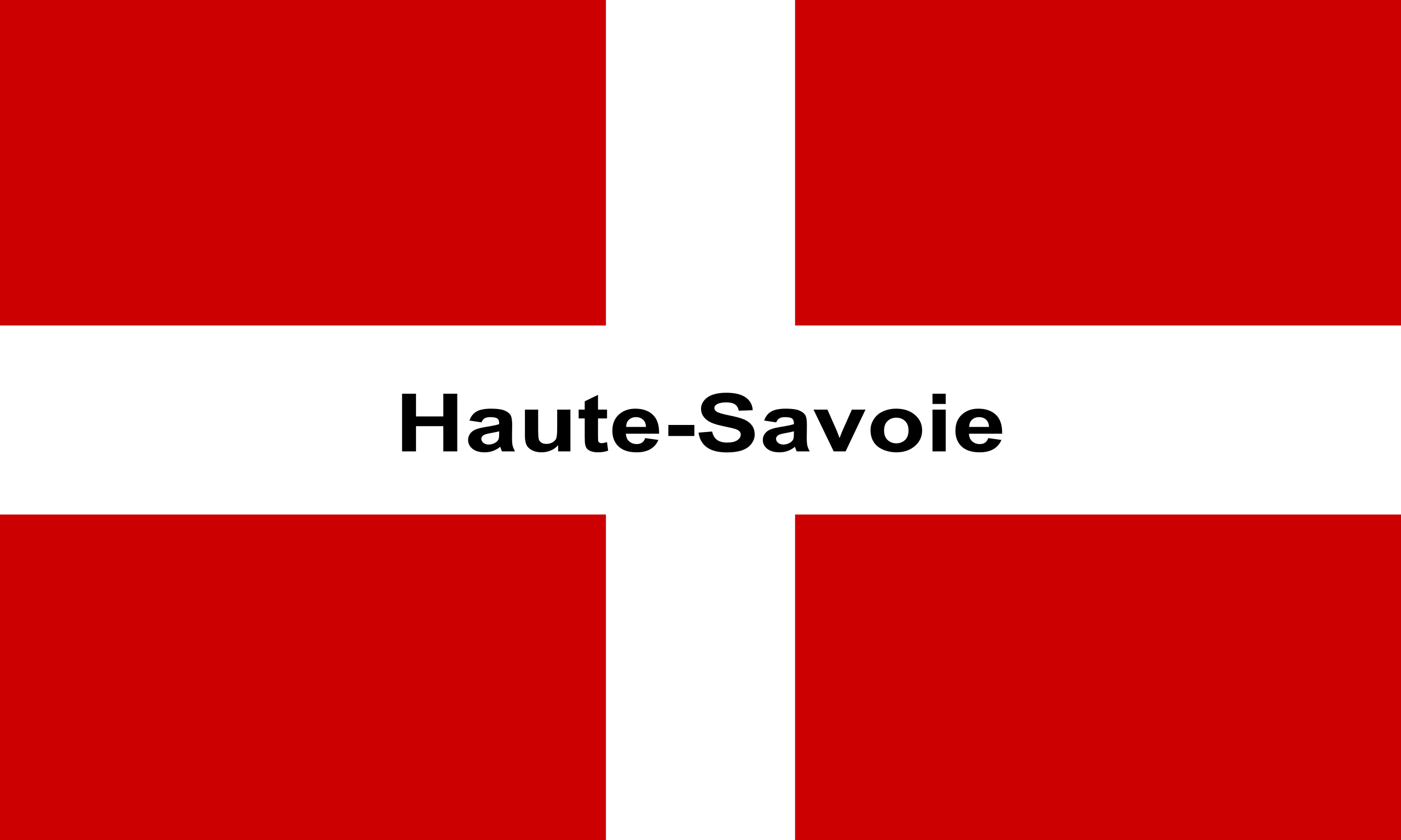
Why it's so clever - the flag of Haute Savoie -

Edit, forgot to add, the Swiss flag has red gaps at the ends of the white cross, in case you were wondering

It still bothers me that the cube inside the cube is bigger than the outer line, despite forming the outer line during the intro animation. It will never stop bothering me.
It retracted due to surface tension.
I was in the pool!
It's too derivative of the N64 logo if you ask me. Jk, they're both pretty good.
The N64 logo was equally as creative maybe even more, with its 64 faces and 64 vertices.
Not to mention all the memes it spawned.
Nintendo take down of this post in 3...
There are a couple of men in monogramed red and green hats at my front door. Should I open it?
i'd like to have a graphic design community on here
I second this.