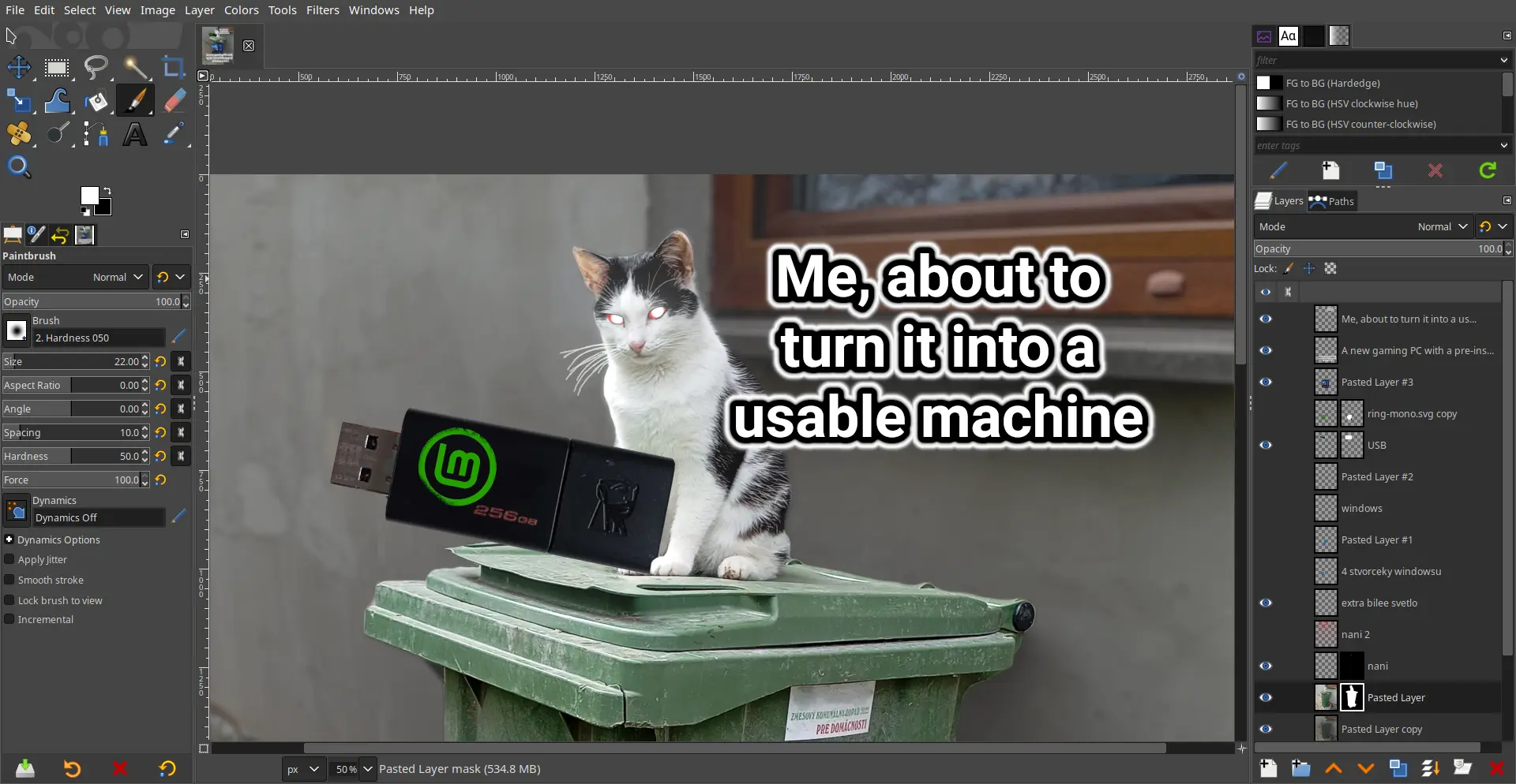
Oiconomia@feddit.de to linuxmemes@lemmy.worldEnglish · 1 year agoWhen I want to use free software to make memes:feddit.deimagemessage-square12fedilinkarrow-up111arrow-down11
arrow-up110arrow-down1imageWhen I want to use free software to make memes:feddit.deOiconomia@feddit.de to linuxmemes@lemmy.worldEnglish · 1 year agomessage-square12fedilink
minus-squareChurbleyimyam@lemm.eelinkfedilinkarrow-up1·1 year agoWhy? Looks basically the same as photoshop, which everybody seems to love.
minus-squareexhaust_fan@lemmy.worldlinkfedilinkarrow-up0·1 year agoAmong other things: monochrome color scheme prevents easy recognition of tools dozens and dozens of arcane options listed alongside super basic options weird sizing of buttons no help search, and no search that can associate synonyms where users don’t know what term to search for no inbuilt suggestions when user behaves strangely (eg. user is spamming the escape key, searching “deselect”, maybe suggest the deselect all hotkey?)
minus-squaretsugu@slrpnk.netlinkfedilinkEnglisharrow-up2·1 year agoYou can change the icon theme in the settings to a color one. That’s what I always do. The scaling can be changed as well. May I ask what are some of the arcane options supposed to be?
Why? Looks basically the same as photoshop, which everybody seems to love.
Among other things:
You can change the icon theme in the settings to a color one. That’s what I always do. The scaling can be changed as well.
May I ask what are some of the arcane options supposed to be?