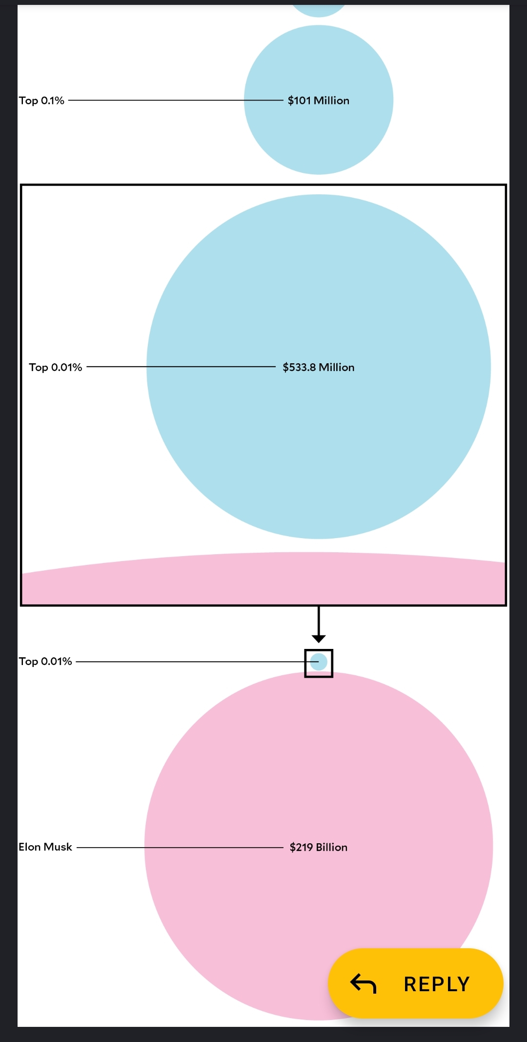
Circles aren’t the best shape to illustrate it because doubling the area of a circle doesn’t doesn’t really make it look twice as big…
I much prefer this: https://mkorostoff.github.io/1-pixel-wealth/
Damn, that’s an extremely powerful method of data visualization!
Fuck I got tired and quit half way though the graphic.
If you didn’t get past Bezos, you weren’t halfway yet.
I made this little game with the same idea:
Well first off circles are like the worst shape they could have used
OP misspelled “eat” in the title.
Top 10% of the US population has a net worth of 4 million? That does not seem right.
Net worth includes all asset value. Pensions, investments, and property.
That seems about right to me. A lot will be tied up so liquid assets will be lower.
The 50% upwards middle class being $400,000 will mostly be the value of a house.
Very annoying they just specify “average”. I’d expect this data to be based on the median values so it should just say.
Even with the value of your house and 401k, it’s still very hard to believe. I just did a quick Google search and the 90th percentile in 2001 is 1.6 million, which seems more accurate.
The top 10% includes all the people in the top .01% which skews the average higher. You might only need about 1.6 million to be in the top 10% but the average will be higher.
Ah, that makes sense. Appreciate the explanation.
Surely there’s enough hungry pets out there we can feed them to. Whack em in a can of cat or dog food problem solved
Holy shit middle class is half a million now?
The days of making 6 figures means nothing now lol.
Net worth and income are totally different. 6 figures for income will give you a multi million net worth with a modicum of budgeting.
Definitely a difference. Thanks.
That’s net worth, not salary.
So, how do we tax unrealized gains?


